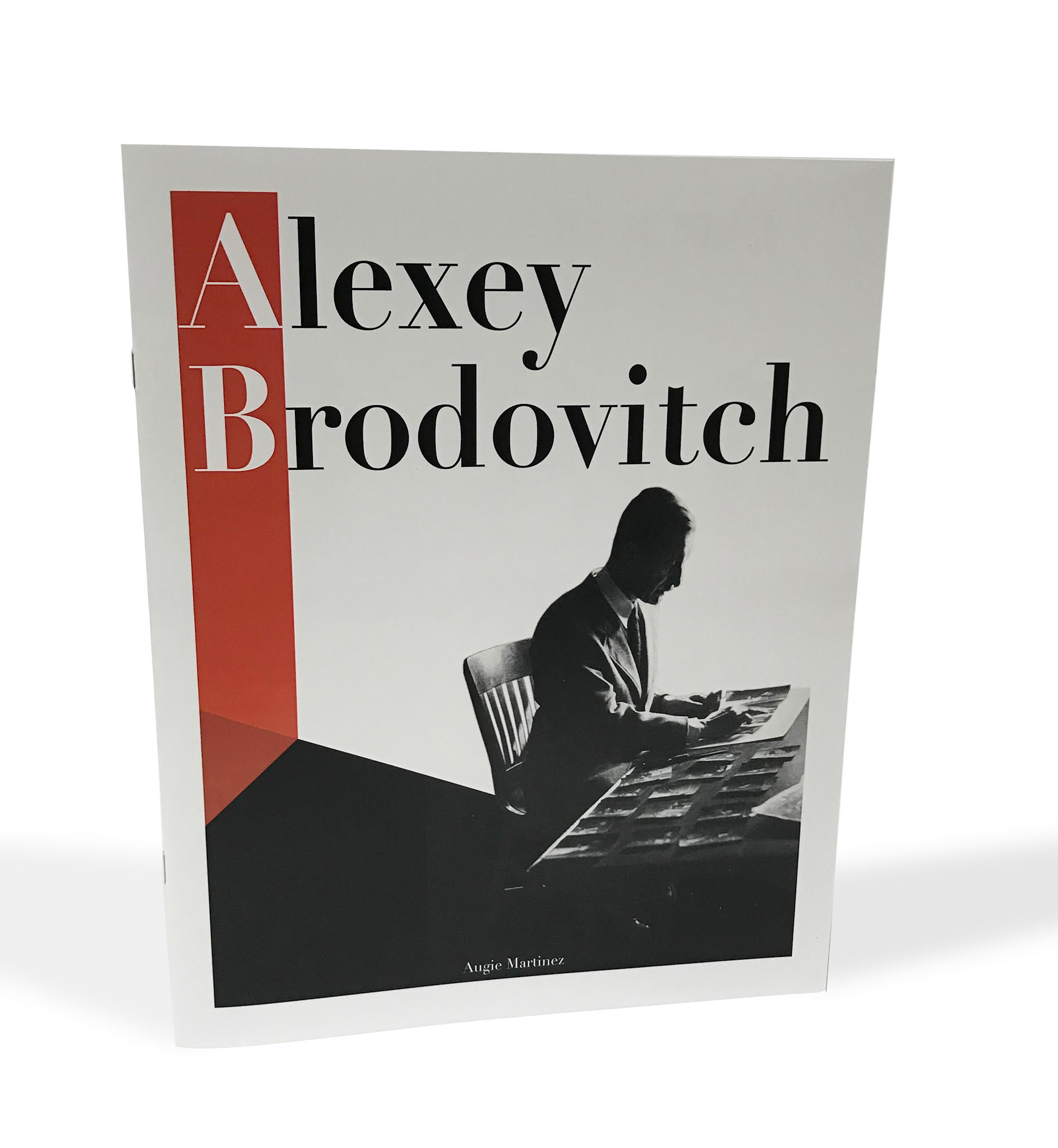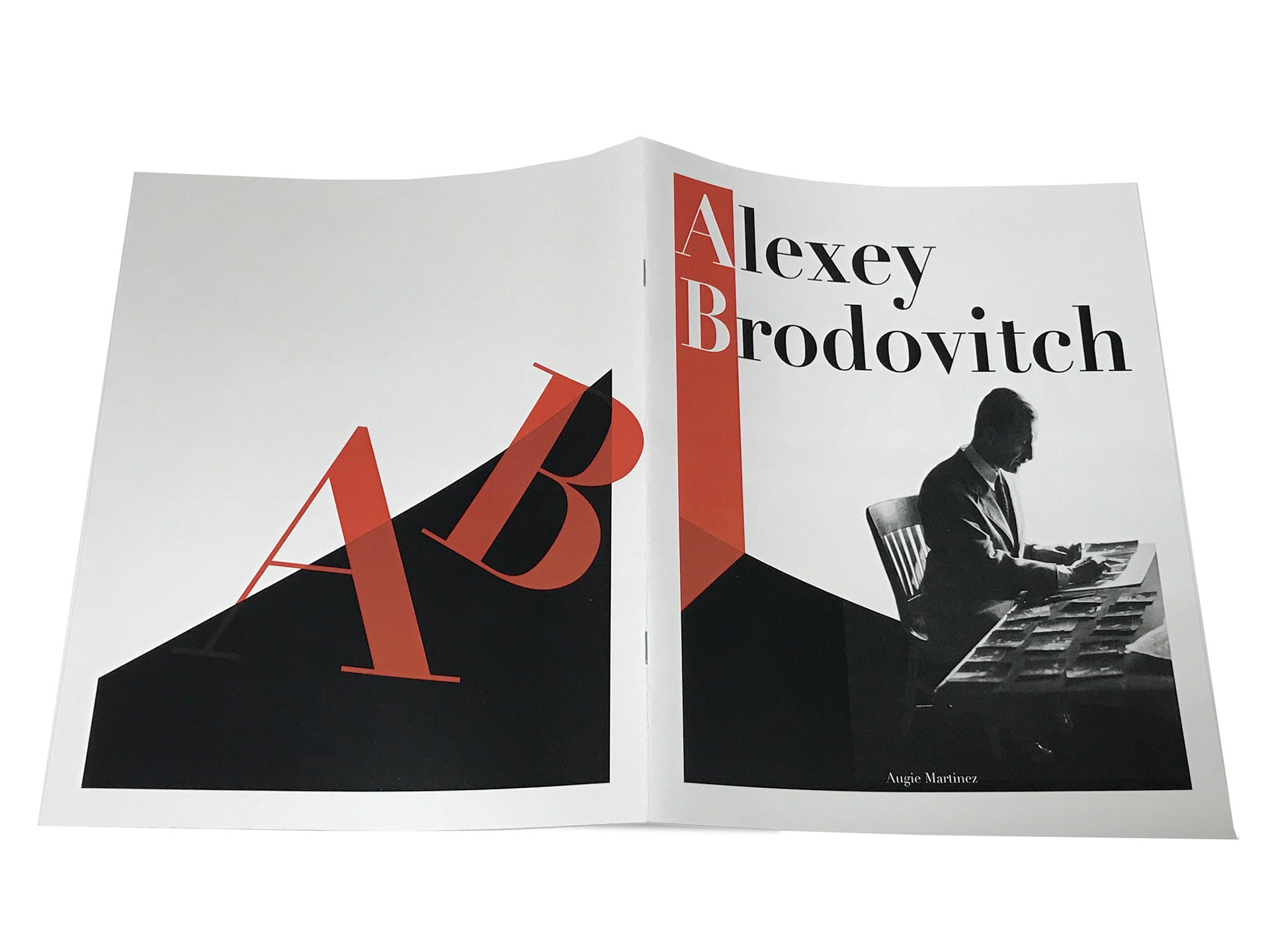
This is a booklet that I designed and created in homage to Alexey Brodovitch.
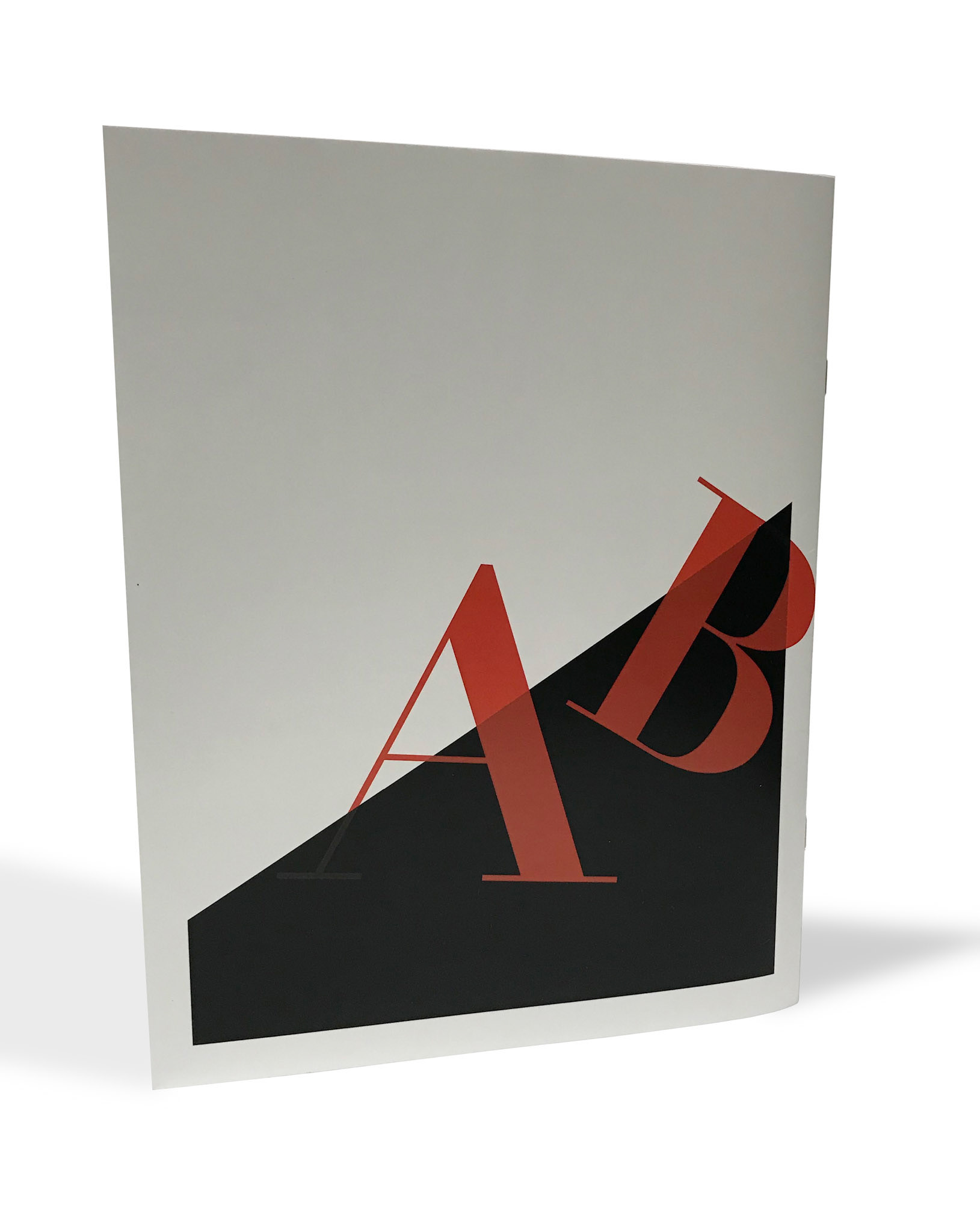
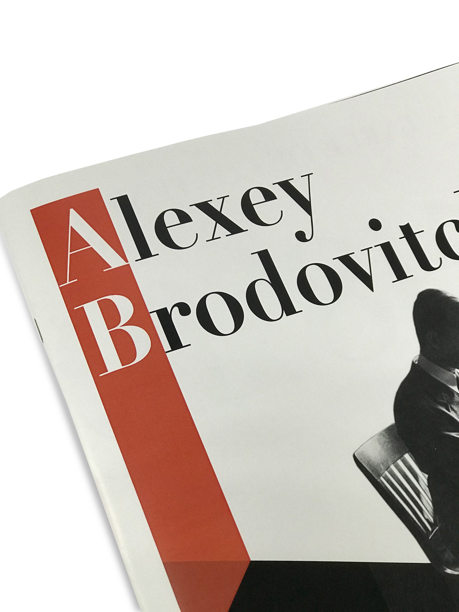
The fundamental of hierarchy, layout, font choice and usage of white space were key areas to focus on when designing the front & back cover and spreads.
A goal in mind as it was a homage piece was to make it apparent and similar to Brodovitch's style, without over stepping into his territory of creation and creating my own approach and unique spin in the process. Another challenge I wanted to tackle, was when this booklet was read that I wanted to engage the viewer and keep their attention the entire time. It was of high importance for me to capture the viewer's eye and hold it, engaging the viewer's eye the entire time to result in them reading the booklet all the way through without putting it down.